
By 1993, even dumb ol' me was waking up to the idea that the old collecting model wasn't going to work anymore.
I couldn't possibly collect everything that was on store shelves at this rate. The objective every year since I started in 1975 -- find wax packs at stores, buy them -- was a solid purchasing model for years and years. But by the late 1980s, I couldn't keep up with all the sets out there and a lot of times I didn't care, and even in the years when I did try to buy them all, say 1991 and 1992, I was reaching the realization that this was stupid.
So, in '93, I went into the collecting season with my eyes wide open. I would collect only what I knew or what appealed to me. And this is how the year went:
Find Topps, buy Topps. Find Fleer, buy a little bit but I didn't really like it. Find Donruss, buy a little bit but I didn't really like that either. Find Score -- but it wasn't easy -- and buy it. Find Upper Deck and ...
Holy smokes, drug store checkout dude, what were THESE??
I fell in love with Upper Deck for the first time in my life that year, and that was all I bought for the rest of 1993.
So, I think you know how the latest installment in the "Best Set Of The Year" series is going to go.
But because I scanned ALL THOSE CARDS, I'm going through the ritual anyway, and those of you with strong constitutions will join me to the very end. There are 17 -- SEVENTEEN -- sets to get through! That's a jump of five over 1992, and even that was nuts, and I'm still ignoring O-Pee-Chee and Conlon and other fringe stuff. I'm also not including Upper Deck's first SP offering, I don't care what the Derek Jeter card costs, just because this set was so exclusive right from that bat, and a lot of collectors never saw it.
People were still thinking they could get rich off of cards in 1993, and card companies were producing more and more sets, but everybody could see the writing on the cardboard by this time. Even I could. But little did we know how far the collecting world would fall.
OK, if you have the guts, here we go:

1993 Bowman -- the front
Plusses: Bowman transitioned from gray cardboard to slick, white stock in 1992 and stayed with it in '93. It's clean, clear, glossed-up and effective. I don't enjoy it as much as '92 but it's solid, if somewhat boring. ... Bowman adds its full brand name to the front rather than just the stylized "B". ... Not a lot of extra stuff in the design, it's Stadium Club-esque and lets the photo shine.
Minuses: Bowman still refuses to give you the position name or team name, emphasizing the only thing that matters in this set -- the player.

1993 Bowman -- the back
Plusses: My goodness, this is the most modern Bowman back to date. ... Bowman scrapped the team-by-team stats so it could emphasize a portrait photo on the back. ... It's well-designed even if we're stuck with minimal stats.
Minuses: WHERE ARE THE TEAM-BY-TEAM STATS? WHY DO YOU THINK ANYONE EVER BOTHERS TO TURN OVER A BOWMAN CARD?
1993 Bowman -- overall
Plusses: Bowman was rounding into form as a prospect-first set, first jumping in with both feet in 1992. So if you like that kind of thing, there are rookie cards galore, of players like Brett Backlund, Desi Wilson and Pedro Grifol. ... For the second year in a row it's 700 cards strong, 708 to be exact. ... Bowman randomly inserted, usually one-per-pack, 48 insert cards with gold-foil borders, which focused, naturally, on the young stars of the game and prospects. ... Bowman scrapped the brutal Olin Mills polo-shirt cards it used in '92 for prospects. ... Derek Jeter's rookie card is in this set, you guys (I'll be saying this a lot).
Minuses: For me, this set begins Bowman's decade-long (or more) plunge into irrelevance. It's not exciting, it's full of players who didn't really have MLB careers and this theme continues to this day. ... The whole look of the thing is boring and nothing about it gives me a reason to return to it.

1993 Donruss -- the front
Plusses: Like Bowman, another clean, unobtrusive design and, best of all, it does not look like 1992 Donruss. ... I know younger people than me regard the beveled edging on the design as quaint and almost childish. To which I say, have you seen Donruss' bat-and-ball design from 1982, which looks like they hired a precocious 9-year-old to head the art department? This is what Donruss does! ... The team logo makes its return to the front after a year away, as does the Donruss word mark. ... Like many of the sets issued in 1993, there are many fun and interesting pictures in this set. Card companies clearly stepped up their photo game in '93.
Minuses: The look of this set is just (*shrug*). Can't find anything to complain about and that's the best I can say.

1993 Donruss -- the back
Plusses: This doesn't look anything like the Donruss backs we knew and sort-of loved in the 1980s and my, it's marvelous. ... This '93 card back looks a lot like Upper Deck's '93 card back and that is some kind of compliment to Donruss. ... Great photo for a CARD BACK. ... Still including contract status info along with detailed "how acquired" info. ... Digging the red home plate card number logo.
Minuses: Scrimping on the stats, still, but I'll allow it this time. ... Does anyone else feel like the action photos on card backs need captions? Just me?
1993 Donruss -- overall
Plusses: We're at 792 cards, you guys, the largest set Donruss had made to this point. ... After the disaster of '92 Donruss (and overall the worrisome trifecta of 90-91-92 Donruss), Donruss was digging out of its darkest period. ... The second series in this set presents the new Marlins and Rockies players, although nobody's in the new expansion team uniforms, meaning you get nothing but fun cards like this:

Team collectors actually hate these cards, and as a team collector, I'm not crazy about them either. But I can't get mad at this. ... The Diamond Kings are still going strong, if you like that kind of thing.
Minuses: If you're a rookie hunter, Donruss missed out on the top rookies from this time period and the set is dirt cheap because of that (hey, that's actually a plus). ... Except for the expansion draft cards, the set is pretty forgettable, the kind that you put in a box and never come back to, unless you have a blog and do posts like this.

1993 Finest -- the front
Plusses: OK, you need to put yourself within the year of 1993 to appreciate this, but this was a mind-blowing look for collectors at the time. The card seemed like it was made out of metal and it was shinier than anything seen on a card before and they almost appeared to be 3-D! ... Finest card fronts always look sharp. They scan like garbage but anybody judging the set by scan appearance needs to get one in their hands, stat.
Minuses: If you want your cards to look and feel like cardboard, this fails completely. ... There are no team names or position names, continuing the trend toward hailing the mighty player over the team. ... It has the look of a one-off set, but, of course, Finest is still around.

Plusses: More shiny? I don't know. It's fine.
Minuses: Does anybody look at Finest's card backs? Ever?
1993 Finest -- overall
Plusses: Finest used the process of "multi-color metalization" and "chromium technology" to make these cards. I'm reading this right off the Standard Catalog of Baseball Cards description of the set because the technique is far too involved for me. But that aside, this is the set that introduced the Chrome brand to the masses that has entranced many a collector. ... The beginning of cards that are Sexy, not for who is on the card but for its look and feel.
Minuses: This is only 199 cards, barely a set. I almost didn't include it in this review, but it's here because it's a breakthrough set. ... This touched off the card collecting mentality that cards must be "innovative" with "new technology." Not once have I wanted my baseball card to be "innovative" or technologically inclined. But that's the world that the '90s created and now there's a whole crowd of people that bags on Topps because they're not creating robot cards, or whatever. ... This set also helped increase the price per pack that card companies could charge customers. ... I never saw these cards in '93. Card shop only?

1993 Flair -- the front
Plusses: This set hits you over the head with its premium feel from first glance. ... It's very snazzy, with a dream-like vibe to it. ... Classy gold-foil etching.
Minuses: The look of these creep me out. The large portrait photo hovers over the action shot without regard for the rest of the photo. It looks like it's part of the photo but not really, like a Mike Piazza ghost.

1993 Flair -- the back
Plusses: Good for Flair showing all of those stats. ... They somehow made them readable even though they're superimposed over a second (a third?) image of the player. ... Gold foil on the back, too! I feel like I've entered a fancy jewelry store where I don't belong.
Minuses: The write-up is a jumble. I can't read type on top of type.
1993 Flair -- overall
Plusses: This was Fleer's entry into the super-premium card market and it's totally super-premium. ... Thick cards that make you feel like you're doing more than trading bubble gum cards on the playground. You'd never throw these against the wall. ... After years of seeing too-thick cards like Tribute and Triple Threads stretching binder pages, I can appreciate just the right amount of heft with Flair.
Minuses: I already mentioned I'm not crazy about the look of these cards. They're also easy to get mixed up with 1994 Flair, but that's not '93 Flair's fault. ... I don't care about this, but I feel like I need to add it for those who do: there are virtually no rookie cards in this set.

1993 Fleer -- the front
Plusses: Like many of the sets in 1993, there are several fun photos in '93 Fleer. ... Since the design isn't as confining as 1992 Fleer, there is more room to play in this set.
Minuses: The border frame for this set is described as "silver" but all I see is "gray" and a continuing theme with Fleer as it also used gray in 1983 and 1989 and I am not crazy about either set because of it. It's just not an exciting color for a frame. Either make the frame white or color it up. ... Fleer clings to sideways writing for the second straight year. It's not a good look. Hear that 2020 Topps?

1993 Fleer -- the back
Plusses: I know it takes up too much space, but I like the monster name A LOT. ... Somehow Fleer manages to get all those stats in using about one-third of the card space. ... After ditching team logos completely in 1992, Fleer returns the team logo to the back, like it did in 1991. Seems like the right call for a company I associate so much with the team logo.
Minuses: I'm staring at the mass of gray space wondering what they could do with it. ... Not crazy about the card number in the bottom right. ... Player's vital stats difficult to read even magnified and back-lit.
1993 Fleer -- overall
Plusses: It's more interesting and better-looking than 1989, 1990, 1991 and 1992 Fleer. ... The photo selection is pretty good in this set. ... The Super Star Specials are still going strong. ... It's 720 cards. There were some BIG sets in 1993.
Minuses: This is one of the first sets that seemed to suffer because they were too busy churning out inserts. There are like 8 or 10 inserts sets with '93 Fleer, which was a record for them at the time. A lot of companies were getting into inserts at the time, but it would prove to marginalize the base set over time and this is one example. ... I traded away a lot of my cards in this set and unlike other sets that I trade away, I have no regrets.

1993 Leaf -- the front
Plusses: In '93, Leaf drastically revised the look of its cards, going with the full-bleed craze that Stadium Club kicked off two years prior. It was good look for Leaf as it had used silver/gray borders two years running and, man, was that dull. ... I love the ribbon, foil-stamping look. That is quirky and fun. I didn't know Leaf could be quirky and fun until this set. ... Lots of space for the photos.
Minuses: Unfortunately a lot of the photos are the same -- batter batting, runner running, pitcher pitching -- that combined with the full-bleed look makes for repetitive cards and confusion among similar full-bleed sets issued around the same time (looking at you, Ultra).

1993 Leaf -- the back
Plusses: Among the finest and most memorable card backs ever made. Sure, you can't read a thing on them, but card backs weren't meant to be read in the '90s, they were basically just another front. ... The fascinating element of these backs are the landmark backgrounds for each of the teams and Leaf found two different landmarks for each team! I love this. ... The ribbon theme continues with the card number.
Minuses: Stats are sometimes unreadable, if you care.
1993 Leaf -- overall
Plusses: Leaf found something to make it distinctive and that's those card backs. It's almost a reason to store your '93 Leaf cards in a binder back side front. ... Leaf kind of broke out of the doldrums with this set. ... There were special Frank Thomas autographed cards inserted into packs in this set.
Minuses: These cards seem to be everywhere. I can't get rid of all the Dodger dupes I have from '93 Leaf. ... The fronts get to be mind-numbing after awhile. ... The cards tend to curl.

1993 Pacific -- the front
Plusses: OK, this certainly was different for an American card set. There is Spanish on the front! Lenny Dykstra is not an outfielder, he is a jardinero! ... Team logo on the front, always good move. ... It's colorful: a lot more colorful than future Pacific sets, which would become obsessed with gold.
Minuses: More up-and-down writing. ... A bit simplistic.

1993 Pacific -- the back
Plusses: I think I like the look of the back better than the front. Quite light and colorful. ... There's a Dodger and an ex-Dodger in the photo! ... Spanish-speaking people finally have a card back for them.
Minuses: If you can't read Spanish, and you're pulling this card a decade or more before you can translate words on your phone, you have no idea what this says. ... Card number goes at the top, you guys. ... Limited stats.
1993 Pacific -- overall
Plusses: This is the first time a major league baseball card set was issued exclusively for the Spanish-speaking market, which seems long overdue, considering baseball's popularity in Latin American countries. ... It's 660 cards, which is impressive, considering Pacific to this point had been issuing smaller legends-type sets in earlier years. ... The "jugadores calientes" insert set, a forerunner to Pacific's prism insert sets, must've been wild at the time, if hard to read.
Minuses: I don't know where these cards were sold, but since I was a white dude living in a very white county at the time, I didn't know these existed at all. In fact, Pacific as a brand was dead before I even knew they existed. ... The card stock is pretty flimsy and a bit subject to paper loss.

1993 Pinnacle -- the front
Plusses: Seriously, one of the best-looking sets issued in the '90s. Just classy and cool as all heck with that black border and inner white frame. ... After diminishing the photo impact in its debut in 1992, Pinnacle made the photo the star of the show in '93. It's glorious and why am I not collecting this set? ... Pinnacle continues the dominant black theme that made '92 all the rage.
Minuses: I could do without the ellipses trailing from the name to the foil Pinnacle logo. A simple white dot or diamond would be so much more awesome. ... The listing of the team name at the top is a bit unusual. Maybe not the first place where a collector would look. ... Subject to chipping.

Plusses: Pinnacle stayed with what worked on the back of the '92 cards, it's essentially the same back. ... I love everything about this back, like I said in the '92 review, it's like everything lights up here. ... Got to love the team logo. ... Look at that very readable card number.
Minuses: Sometimes one line of individual stats is the sacrifice that you have to make but I wish it wasn't so. ... Still going with that weird, anti-counterfeit thing that looks like a tire tread.
1993 Pinnacle -- overall
Plusses: Just as cool as the 1992 set except even classier. ... This set must look phenomenal in a binder. ... Derek Jeter's rookie is in this set, you guys. ... Score does it again with its high-end set both in look and in the interesting subsets:

These have always been fantastic.
Minuses: Black borders + gloss = chipping. ... There are a ton of rookies in this set, like an EMPHASIZE THE ROOKIES number of rookies. This is probably why I've never tried to complete it. ... The beginning of the end of me really liking Pinnacle. I couldn't get into the gold montage of later years.
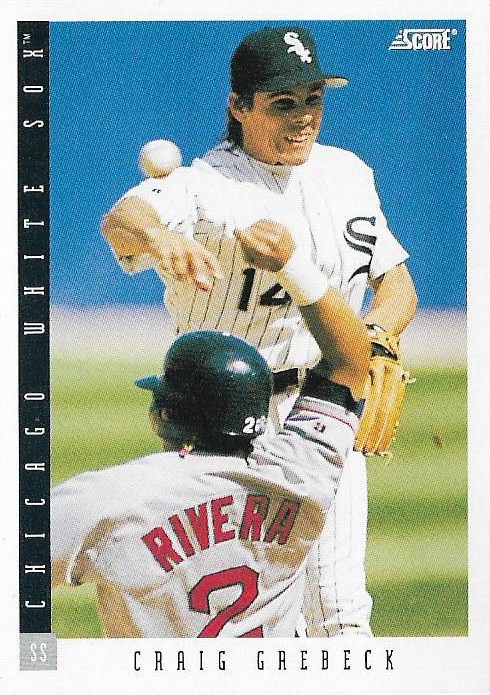
1993 Score -- the front
Plusses: I could list a series of sets that stepped up their game from 1992 to 1993 -- Donruss, Leaf, Upper Deck -- but the most notable one is Score. I despised '92 Score for a multitude of reasons that you'd have to read the 1992 Best Set of the Year post to absorb. The '93 Score look washed that away. ... This is a clean, pleasant look. ... I adore the team color-coding. Among my favorite of all-time.
Minuses: Sideways writing (the thing to do in the early '90s apparently) combined with a thin letter font make for difficult reading on cloudy days.

1993 Score -- the back
Plusses: As usual, a Score back is an informative back. ... It's well-arranged once again, and that prominent team logo is terrific. ... The more muted colors is welcome after those jarring color combinations in '92.
Minuses: A bit difficult to read. No need to throw that "Score" word mark underneath the type.
1993 Score -- overall
Plusses: You know what you get with a Score set: a complete, thorough product, with a simple design and solid photos. ... Possibly the most readily available Derek Jeter rookie in 1993. I believe it's the only one I own. ... Nice old-school Highlights and Award Winner subsets and those fun All-Star caricatures. ... The end of an era. This would be the last non-UV-coated Score set.
Minuses: After behemoth outputs in 1991 (893 cards) and 1992 (910!), Score trimmed down to 660. Maybe that was for the best, but I admire monster sets. ... For whatever reason, these cards seem to be a little difficult to find. I wish 1992 Score was as difficult to find.

1993 Select
Plusses: I never thought I would enjoy a green set so much. I've loved this look and design since the moment I saw these cards for sale. ... The design makes it seem if the players in the photo are off-balance, as if they're really IN ACTION, which may be disorienting for some, but I like it. ... Lots of good photos in this set.
Minuses: If you don't like green, I guess you hate this thing. The good news is the Traded set is in blue.

1993 Select -- the back
Plusses: Love the theme-continuation on the back. ... I admit I haven't read many of the Select writeups on the back, but this one is filled with stuff on which to comment: "Don is a joy to behold ..." Also, the Kubek nonsense about Mattingly being the best because "he practices harder than most guys play." No. How about Mattingly was just gifted athletically and extremely smart on the ballfield? Don't give me that practice junk. We in high school?
Minuses: There's a whole bunch going on with this card and it's probably not arranged well. ... There's that tire tread and there's that one year of stats.
1993 Select -- overall
Plusses: I continue to be obsessed with this set. ... well, let me rephrase that. I am semi-obsessed with this set. If I was obsessed, I would have completed it and all the inserts, too. But I am super fond of it just because it looks so unusual in the most simple way possible. ... I think 400-card sets don't get the credit they deserve. If the collation isn't a bitch, this seems like an easy set to complete.
Minuses: This was Score's third set, basically signaling its arrival in the "mid-major market," because now we had a class system of customers that continues to this day, where retail shoppers are deemed not worthy enough to buy cards like Finest or Museum.

1993 Stadium Club -- the front
Plusses: A monster, full-bleed set of distinctive photos was back for a third straight year from the makers of Topps. ... Everything you loved about '91 and '92 SC is here again. ... Stadium Club added a bit of red to its "design" this year, along with a traveling baseball. It gives '93 SC a memorable look.
Minuses: Can't say I'm a fan of the red streak. ... Like some of the other early '90s SC photos, the processing on some of them is dated.

1993 Stadium Club -- the back
Plusses: Everything that you've come to know and love about Stadium Club backs is all here, plus an extra photo!
Minuses: SC switched to a vertical look for the first time and it does not work well. Everything is a jumble. That rookie card is wedged in. ... There are no graphs this time, just numbers and columns that take a while to decipher. ... That stat type at the bottom is tiny.
1993 Stadium Club -- overall
Plusses: Stadium Club was 750 cards in '93, so it was still putting out a sizeable, quality product. ... Per usual, there are lots of memorable photos in this set. (I will keep the Marquis Grissom card til the day I die). ... SC was still king of the premium market in '93, even if the gap was closing. ... If you bought a box, you could get a Master Photo, which I guess was exciting back then.
Minuses: Still problems with the cards sticking together. ... The excitement was starting to wane a little at this point. ... What happened to the 900-card set?

1993 Studio -- the front
Plusses: Studio went with full-color fronts for the first time. It really works. This is the first of the really nice-looking Studio sets. ... The team name backdrop is terrific. ... I like the gold-lettered facsimile signature even if it drives autograph collectors crazy.
Minuses: None, unless you're an autograph collector. It's pretty.

1993 Studio -- the back
Plusses: You still get the insight of Studio but with an added photo of the player. ... Is that the largest photo of a head on the back of a baseball card set ever? Bonus points if so. ... "Loves to Face," "Hates to Face" should be on the back of every baseball card.
Minuses: I don't know how prepared collectors were to see a face that size on the card back. ... Studio was still giving out personal views of the player but they weren't quite as fun as in past sets. Studio would ditch that aspect of its set in future sets, which is a disappointment.
1993 Studio -- overall
Plusses: Studio went full-bleed in 1993 and it worked. As always, for me, Studio's selling point was providing insight -- and sometimes comic relief -- about a player's personality and interests.
Minuses: It's a fringe set. But that's generally understood.

1993 Ted Williams Card Company -- the front
Plusses: An interesting look with a pair of action photos of the player, one faded into the background. ... A nice note on the front that this was the debut of the company.
Minuses: If the photos aren't in color, and many of them are not, it has a difficult time attracting interest.

1993 Ted Williams Card Company -- the back
Plusses: That's an old-school back, almost an oddball card back. ... But you get much of what you need from a legendary player. ... The listing of a player's "Top 5 career best seasons" is interesting.
Minuses: I admit I haven't looked at my TWC card backs much so I haven't found much to disagree with or grow fond over.
1993 Ted Williams Card Company -- overall
Plusses: Who knew that a company named after one of the greatest hitters that ever lived would provide such an interesting cross-section of players? ... One of the most complete and exhaustive legendary looks at former players this side of TCMA. I love this set because it includes both Rick Ferrell and Cesar Cedeno, both Orlando Cepeda and Mel Parnell. ... All of the subsets are well-thought-out and give light to overlooked aspects of baseball, such as Negro League players and famed player's minor league careers. ... This was quite the effort for a company that didn't have a license from the player's union. ... POGS!
Minuses: Not the most pleasing-looking set. Lot of grays and browns.

1993 Topps - the front
Plusses: Topps had been chasing Upper Deck's look for three years now, and in terms of photography it was just about there. 1993 Topps includes a ton of great photos. ... The design steps aside for the photo in a way that still gives the card some character.
Minuses: This design does not appeal to me. If these are supposed to be photo corners, why is Topps using such a dated look for its set? After 1992, this disappointed me and is part of the reason I went running to Upper Deck.

1993 Topps -- the back
Plusses: It's readable. ... When the photos are head shots like this one, they're nice. When they try to squeeze an action shot in there, they're not.
Minuses: Not crazy about the candy colors. ... Most of the writeups are pretty boring.
1993 Topps -- overall
Plusses: Woo-baby, we're up to 825 cards here. Topps was living high before the big crash. ... Hey, did you know Derek Jeter's rookie is in here? .... The Black Gold insert set was one of the best-looking insert sets that had been made to this point. ... The Marlins and Rockies cards were way interesting.
Minuses: I won't say that Topps' sets in 93-94 were as uninspiring as that 1996-99 period, but I rarely go back to the '93 set (or the '94 set). It just can't compare to some of the sets that were released the same year.

1993 Triple Play -- the front
Plusses: Triple Play grew up a little after its debut the previous year, going with serious black. ... A much more pleasant design than the '92 issue. ... I love large labels.
Minuses: Chipping? Don't know.

1993 Triple Play -- the back
Plusses: Wow, the old "hold it up to a mirror trick." I don't think I saw that since reading "Highlights" in the doctor's office waiting room. ... Triple Play added a photo on the back, which was a good move as the '92 back was a bit spare.
Minuses: Nothing worth mentioning.
1993 Triple Play -- overall
Plusses: A second straight year of a child-focused set. ... Cards came with an Action Baseball game in which you could play a scratch-off game (think 1970, 1971 Topps scratch-offs).
Minuses: This niche set was kind of running its course as it would last just one more year.

1993 Ultra -- the front
Plusses: Lots of action. Lots of photos.
Minuses: Here are the differences between '93 Ultra and '92 Ultra: the gold-foil Ultra logo is over the baseball instead of on the baseball, the triangle at the bottom is marbled, the team name and position logo box is shorter and marbled, and the player name box is marbled and extends from the card edge. That seems like a lot, but it's actually almost the exact same look and MAKES ME CONFUSE THESE SETS EVERY TIME. I am sure I have '93 Ultra cards in with '92 Ultra cards in one of my card boxes as I write this.

1993 Ultra -- the back
Plusses: The baseball diamond background is a little more appealing to me than the grid background from the previous year. ... The orientation of the head shot is better positioned than the previous year.
Minuses: The card back is more of an art project than a functional source of information.
1993 Ultra -- overall
Plusses: I guess the '92 Ultra set was appealing enough that Fleer didn't think it was necessary to change their premium model much. ... Ultra is well-loved for its action and it certainly delivers.
Minuses: I mentioned it already. It's not distinctive enough to stand on its own.

1993 Upper Deck -- the front
Plusses: Where to start? A terrific design with, at long last, a new look that breaks from the 1989-92 motif. ... The largest collection of distinctive and interesting photos produced in a card set at that time and perhaps ever. ... The 3-D effect of the player's image obscuring the Upper Deck name is one I'll never grow tired of.
Minuses: I guess you could make the argument that the script writing of the player's name is difficult to read.

1993 Upper Deck -- the back
Plusses: After forcing collectors to tilt their heads to read Upper Deck's card backs, as the photo was often oriented differently than the stats, UD finally connected the dots and presented photos and stats so you could absorb them all at once. ... The back photos are as delightful as ever.
Minuses: Not enough stats, say traditionalists.
1993 Upper Deck -- overall
Plusses: Just an epic set, 840 cards. ... Upper Deck was an afterthought to me as a collector until the '93 set arrived and suddenly it became my favorite set. That says it all in terms of what '93 Upper Deck achieved. ... One of the landmark sets of the '90s. ... I don't know where this set ranks in terms of my all-time favorite sets (possibly a post someday), but I'd say it's in the top 20. ... The amount of subsets, and the appeal of them is off the charts, from the beginning to the end. ... This is the first time I became aware of inserts, even though they had been around for a couple years already. I didn't go crazy over them but I kind of liked them.
Minuses: You practically have to be a curmudgeon to at least not show this set some respect. I can't find much to say wrong with it.
OK, we're finally at the end.
The 1993 collecting year will be remembered for a few things: the arrival of Marlins and Rockies cards, the Derek Jeter rookie cards, the debut of Finest and Pacific and one of the first notable sets devoted to legendary players.
But for me, the 1993 collecting year will be known as the end of my second era of collecting. And I wouldn't return in force for 13 long years.
So which set sent me off in style?
Of course, it's ...
...
...
...
...
...
...
...
...
...
...

Upper Deck!
Ranking: 1. Upper Deck, 2. Pinnacle, 3. Stadium Club, 4. Select, 5. Ted Williams Company, 6. Score, 7. Topps, 8. Finest, 9. Leaf, 10. Fleer, 11. Donruss, 12. Studio, 13. Ultra, 14. Flair, 15. Triple Play, 16. Pacific, 17. Bowman
Total ranking: Topps - 6; Stadium Club - 3; Upper Deck - 3; Donruss - 1; Fleer - 1
P.S.: Thanks for reading. I'm going to have to find a way to shorten this for 1994 -- just go with the top 8 or top 6 sets maybe -- because there's an even more obscene number of sets in '94.
Comments
I never saw any Pacific or Ted Williams at the time, and I passed on Pinnacle for the most part. It was exciting in 1991, still neat in '92, and I loved it in '94, but the '93 set was too bland for me. Kinda wish I didn't have a Topps factory set (which I opened at some point) only so I could crack open some jumbo packs.
'93 Topps would probably come in at #2 for me, and Select at #3, I think. I'd also rank Donruss higher than you did -- that set's really been growing on me lately for some reason.
1993 is a kind of obscure year to me. I was long out of collecting at that point. What got me back into collecting years later was a big box of junk wax I was given, but it stopped dead at 1992--not a single card from after. Of course I've picked up a fair amount of 1993 in dime boxes and such, but I have not nearly as much as the preceding years. So I don't have strong feelings about too many of these. I guess I'd pick Pinnacle as my favorite design, and I do think Triple Play is very well put together although the backs are lacking.
1: Upper Deck
2: Ted Williams Company
3: Topps
4: Flair
5: Fleer Ultra
The 1993 Topps border - the white area on the sides - is like a mm too large. It is larger than any other Topps card of the era and if you look at your beloved UD and Topps side by side, you can see that the Topps photo looks less impressive because while a mm doesn't seem like much, put it all around the card and next to a card with a smaller white area, suddenly it is all you can see. This bugged me 27 years ago and it bugs me now. The great scrapbook design of the Topps set is great but someone borked the size of the border. Am I making too much of this?
But still. The Topps set is excellent. Upper Deck is amazing (as Mr. Owl eloquently notes above). I really like Fleer here. Ultra, Stadium Club and Bowman were all solid. I've always been partial to that Donruss set and Score even took it up a notch with better design, better card stock and fewer cards. And of course Pinnacle lived up to its name. Heck, even Bowman didn't suck.
Nothing was the same after this. Topps went crazy in 94 and Score turned black, but that's about all I remember from that year. 93 was the end of an era, and it went out in style.