
I found 2018 Topps around 1:30 in the afternoon yesterday. I have no adventures to tell. There were no pack searchers (I've seen a pack searcher maybe once or twice in my life). The merchandise appeared freshly stocked. Blasters, hangers and packs. In fact, when I pulled three loose packs out of the gravity feeder, I was the first customer to touch those babies.
I was first. There's your adventure.
A year ago, I took pictures when I found the first cards of the season. I had time. I was off that day. Yesterday, I worked a double shift because one of my co-workers is on vacation. Topps really needs to work on its release dates because, last year aside, this happens all the time. If they would just ask for my schedule I could get these posts up in a more timely fashion.
So, no pictures of stocked shelves this time, or conversations with the baseball-loving checkout girl. It was all "in, out, drive, open, work, work, work, work, WORK, WORK, WORK, WORK ..."
But I did scan everything for you.
And during all that scanning time, I had time to think. There are five stages to opening 2018 Topps:
1. Excitement
2. Frustration
3. Surprise
4. Bitterness
5. Resignation
I had just gone through all of them without knowing it. I'll go through them for you now. But of course, I'll throw cards in with the self-analysis, so you don't get squirmy.
STAGE 1: EXCITEMENT

Opening the first cards of the season is always exciting. No matter how old I get, no matter how jaded I get, no matter how out-of-sync I am with modern trends, seeing new card product on the shelves and opening that first pack and spotting the first card of the year is always exciting.
The Billy Hamilton card is the first card of the year. That might be the best "first card" I've ever pulled, certainly since I started blogging. I should review those and do a future post.
So, yeah, that was exciting. I saw the new design in person and it was rush.
But what quickly followed was ...
STAGE 2: FRUSTRATION
Ugh. I so wanted to enjoy opening these cards at my leisure. But there was no time. I quickly shuffled through the first pack. Who are these people? I know fewer and fewer players on cards, it gets so frus ...
Well, let's open the pack and I can explain better.
Pack 1
#68 - Billy Hamilton, Reds

#284 - Jose Pirela, Padres
I congratulated myself for knowing who a Padre was.

#42 - Cody Bellinger
Woooooooooooooooooo! First Dodger is the Rookie of the Year. Yeah, I know that's no feat when there are 47 Cody Bellingers in the set. I don't care. Wooooooooooooooo! Future Stars and Rookie Cups and Logos Oh My. Jammed all together so it makes no sense! But woooooooooooooooooooooo!
Let's look at the back of a 2018 card:

Don't let Bellinger's brief career fool you, the five-line limit for stats has returned. I still think that's not the right call, but, again, I get it. I just wish Topps would do something else with the leftover space besides the huge Twitter/Instagram handles (it really looks goofy when the player has no social media and #TOPPSBASEBALL is used in its place) and all that territory for the header. Also, that's some kind of creative white space on the right. We putting jersey swatches in there?
Finally, please note what's got to be the first use of the word "incongruously" on a baseball card. I've now had to look up that word three times to make sure I spelled it correctly. Yes, I've been writing for 30 years.

#316 - Max Fried, Braves
There are a boatload of cards with rookie card logos on them in this set. Topps is on record as being proud of this. Meanwhile, I have no time to figure out who all these people are.

#277 - Aaron Slegers, Twins
Moar rookie. No idea.

#TS-80 - Alex Verdugo, Dodgers, Topps Salute insert
Moar rookie. This is what the Topps Salute insert set looks like (this insert set is the most loosely defined insert series of all-time. "Let's put rookies, legends, throwback uniforms, Mother's Day uniforms, Father's Day uniforms, Independence Day uniforms, dogs that do handstands, and people wearing purple eating pizza in one set and call it 'Topps Salute'").
As pleased as I am to pull another Dodger, Verdugo should not be appearing in insert sets. He has 23 career MLB at-bats. And no guarantee he will be playing for L.A. this year.

#DJH-26 - Derek Jeter, 1996 World Series Champion, Derek Jeter insert set
This is what Target uses to punish you for buying Topps baseball cards. You get a Derek Jeter insert card. I'm starting to miss the old days of pulling colored-border parallels of Miami Marlins.

#155 - Matt Joyce, Athletics

#314 - Colorado Rockies team card
Dudes standing around after: a) their pitcher gives up 9 runs?; b) the trainer tends to the catcher who was just plunked in the junk?; c) security tackles a nitwit who ran on the field?
I need answers!
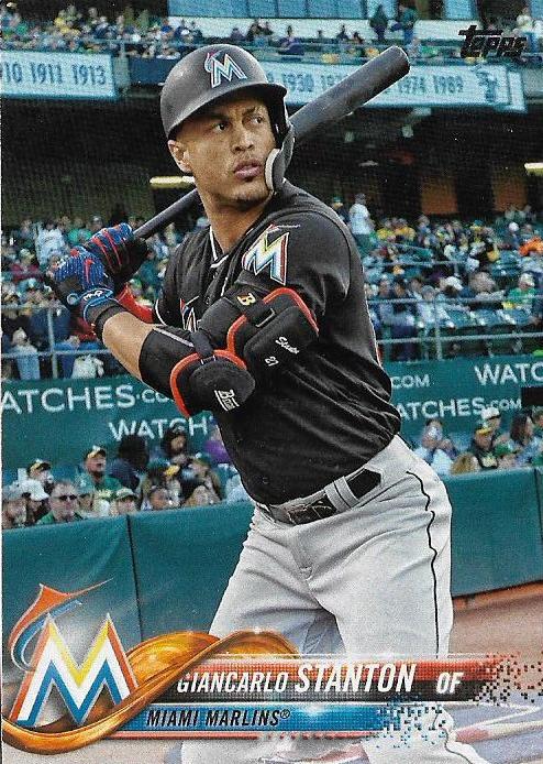
#100 - Giancarlo Stanton, Marlins
Awesome. More cards like this. This will be the last card of Stanton's that I will like for a long, long time.
Also, as Phungo pointed out, hero numbers have returned.

#260 - Rick Porcello, Red Sox

#342 - Sean Manea, Athletics
That's the end of pack one.
And that brings me to Stage 3 of opening 2018 Topps:
STAGE 3: SURPRISE
I don't hate the design.
I've never hated the design. Oh, sure it's weird. Why the waterslide? Why is the name and team bar disintegrating? Why the glowing swoosh light behind the team logo? Is this indicating the speed at which the logo is falling down the slide?
But when I get past that -- and the fact the slide is covering up the first part of the player's name -- I kind of like it. The design is colorful, especially when compared with the last couple of years. It doesn't take up too much space on the card. And, this may make me sound odd, but I get a sense of light and breeziness with these cards that carries over to the back. Bright colors. Sunshine. Beaches. Waterslides. Summer. Baseball. I know it's just me, but it's kinda cool.
Pack 2

#336 - Bruce Maxwell, Athletics
As usual, pulling a bunch of Oakland A's is not helping my self-esteem in trying to identify ballplayers.

#283 - Koji Uehara, Cubs

#26 - Cesar Hernandez, Phillies

#272 - Paul Blackburn, Athletics

#185 - Chance Sisco, Orioles

LTM-CE - Corey Seager, Dodgers, Legends in the Making insert
I am very bored by inserts. If some of them were actually about something, then I wouldn't mind them showing up in packs, but the majority made now are excuses to repeat rookies, stars and legends that we've seen over and over.
It was pointed out to me that this card has an error on the back:

The second line of the write-up should read "Seager left the yard three times ...". If only this were 1981 Fleer and I could search for a corrected version and made a cool 25 bucks.

Home Run Challenge card
Card for a contest I won't enter. Nutshell: Log on. Pick a player. Pick a game. You might win a grand prize to go to the Home Run Derby (no thanks).

#294 - Jose Altuve, Astros, AL Batting Average Leaders

#144 - Jean Segura, Mariners

#212 - Lance McCullers, Astros, World Series subset
Ugh. These things. I forgot about these.
We're going to get nothing but World Series games showing the winners, while the Dodgers, who almost won the damn thing, get completely shut out. I suddenly hate you, 2018 Topps.
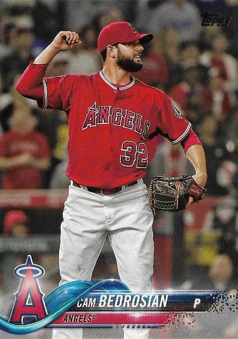
#46 - Cam Bedrosian, Angels

#132 - Marcell Ozuna, Marlins
I'd rather see a player's face on his card.

#30 - Carlos Correa, Astros
That ends Pack 2. Not the greatest pack for me.
But let's talk about the photos, since a couple other bloggers have brought it up.
The pictures do seem better this year, almost Stadium Club-light in a lot of cases. But I don't know if that's merely the wider amount of space reserved for photo presentation compared with the last few years.
It seems that Topps has been leading up to this design for three years now.

In 2016, Topps unveiled its first full bleed flagship design. But chunky graphics dominated the lower fourth and the smoke corners ate up even more territory.

So in 2017, they got rid of the smoke corners, but left some haze on the bottom, which divided the bottom portion of the card from the top portion.

So, learning from their mistakes -- DON'T MESS WITH THE PHOTO -- we arrive at 2018. I still think there's a little bit of haze under the team bar, but it doesn't bother me as much.
What does bother me is ...
STAGE 4: BITTERNESS
2016 Topps and 2017 Topps were just PRACTICE for 2018 Topps!!!
I want all my money back from 2016 and 2017.
Pack 3
#10 - Francisco Lindor, Indians

#143 - James Paxton, Mariners

#90 - Miguel Cabrera, Tigers

#195 - Avisail Garcia, White Sox, AL Batting Average Leaders

#21 - Harrison Bader, Cardinals

LTM-MM - Manny Machado, Legends in the Making insert
HR Challenge ad card

#263 - Chase Utley, Dodgers
Fourth Dodger pulled. Nice pack selecting, Night Owl. Topps informs you on the back that Chase Utley does not participate in social media. This is not a surprise.

#73 - Miami Marlins team card

#57 - Scott Feldman, Reds

#102 - Wil Myers, Padres

#27 - Josh Tomlin, Indians

#240 - Robinson Cano, Mariners
That's a pretty card.
And that ends pack 3.
Everyone let out a big sigh.
STAGE 5: RESIGNATION
I bought just three packs because I don't need any more new cards from sets I'm not collecting. I still haven't put away all my 2017 cards.
But after viewing them, and seeing that I like them just a little, it seems silly to have more 2016 and 2017 Topps -- two unfinished, ugly sets -- than of 2018.
It's also silly to waste money on a set that basically continues what was started in 2016, which is something I don't appreciate. But I will probably waste a little money here and there to take the edge off of life.
That's just the way I collect. I accept it. I'm resigned to it. At least I buy a lot less of it than I did five years ago.
How's that for an endorsement?
2018 Topps: It's not 2016 or 2017 Topps.
Comments
Gianocarlo Stanton's base card in Oakland looks amazing because of the background is legible. When you compare it to the card you pulled afterwards, Rick Porcello, it's even more impressive because of the blurred background on Porcello's card looks horrible.
(Damn typos...)
Thanks for buying these so I don't have to. Always appreciate other guys throwing themselves on their sword.
I just checked on gettyimages.com and found the exact Harrison Bader photograph... Topps did NOT blur out the crowd in the background on Bader's card. I'm going to assume it's the same across the board.
What the heck, that's how a lot of us elect Presidents these days...