
Before I get to more 2016 Topps cards, I have a little story for you guys out there. You ladies may pick up a pointer, too, but really this is for the guys.
Last week, before the new cards came out, I was in Target with a little extra money to spend. I shopped for some necessities -- I really don't remember what they were now -- and threw in a blaster of Stadium Club and pack of Update.
I got to the register and was the second customer in line. The checkout person was a woman, maybe in her mid-20s, kind of attractive if you're into that sort of thing. Checking out in front of me was an old couple. As they left, one of them knocked a couple of Target promo flyers off the checkout counter and onto the floor.
I put my purchases on the counter and as she began to ring them up, I bent down to pick up the flyers on the floor.
It was then that I heard her say, "I can't wait for spring training. I can watch only so much football."
I paused for a second, wondering if I heard what I thought I heard coming out of the mouth of the person in front of me.
I popped up and the checkout gal had a big smile on her face: "I can't really watch hockey either. I miss baseball," she said.
I quickly glanced at my wedding ring. And then I said, "pitchers and catchers report in a month!"
She then proceeded to tell me that her favorite team was the Texas Rangers, which caused me to do another double-take. There are no Texas Rangers fans here, I'm pretty sure most of the population here doesn't know the Texas Rangers are a baseball team. She also said that Yu Darvish is her favorite player. And I know her and I are now the only two people in this area who know who Yu Darvish is.
I held back the instinct to ask for her schedule so I could show up every time she worked and talk baseball with her.
So now you know why I've gone to Target every day this week. It's not to look for 2016 Topps, it's to see if the baseball-loving checkout girl is working today!
Unfortunately -- or fortunately, because of the whole married thing, you know -- I haven't seen her. It was probably some Target hologram ploy to get me to keep coming to the store. This woman probably doesn't even exist.
But if she is there the next time I'm in Target, I'm going to tell her that the new cards this year are a disappointment and she probably should just get any new Yu Darvish cards online.
I'm going to tell her my feelings about the cards aren't any different than they were when I wrote this post.
But I'll try to come up with some new thoughts as I open this 72-card hanger box that I bought last night along with the loose pack. Join me now as I vent.

#269 - Giancarlo Stanton, Marlins
A couple things to get out of the way early.
1) The torso shots are back. So many torso shots. This is a good way to make half your cards irrelevant.
2) I don't mind the full bleed. Sure, it will make Stadium Club a little more difficult to pull off, but full-bleed isn't what's wrong with this set. Or at least it's only a small contributor.

#77 - Clay Buchholz, Red Sox
I wrote a post a long time ago about how I don't like the way he looks. Still applies.

#158 - Henry Urrutia, Orioles
Time to address another design element I find off-putting: the smoke effect.
Not only does it contribute to the "superhero" look of these cards that I already mentioned that I hate, but some of the cards seem so misty I feel like there's something wrong with my eyes.

#15 - Ryan Howard, Phillies
Blurred out faces in the background. There is so much fiddling with the background with these cards that the entire photo doesn't seem real.

#206 - Alex Gordon, Royals
Speaking of "Gordon," Superhero Alex Gordon has spotted Commissioner Gordon's bat signal in the sky! Someone's in trouble! They need rescuing from a baseball player!

#3 - Richie Shaffer, Rays
I don't know who this guy is and the photo barely looks real. Shaffer might as well be a mannequin in the window.

#135 - Colby Rasmus, Astros

#285 - Pablo Sandoval, Red Sox
So much blurriness in the back.
#22 - John Hicks, Mariners
#200 - Josh Donaldson, Blue Jays
#26 - AL Home Run League Leaders

#289 - Nick Hundley, Rockies
The horizontal shots are much better than the vertical. The smoke effect doesn't seem as dominant. This is probably the set that should have been all horizontal.

#126 - David Ortiz/Albert Pujols checklist
At least you can tell this happened in a ballpark.

#181 - Twins team card
Nice shot. I promise you the bubblegum isn't photoshopped into this, although I don't blame you for thinking that. Note that last year's team record, which was on last year's cards, is omitted from the front. Smart move.
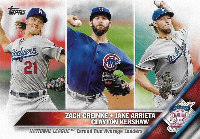
#185 - AL ERA Leaders
#315 - Padres team card
#108 - Ben Paulsen, Rockies

#218 - Andrew Miller, Yankees, gold
These are the gold cards this year. Not only is the smoke covered in golden netting, but the team logo and name line are shiny/foily. This is so not my style. Zippy Zappy wanted the base Andrew Miller. He's getting this one, too.

#BB-22 - Joe Morgan, Berger's Best
Topps is adding more reprints long after everyone grew sick of them. I can understand wanting to pay tribute to Sy Berger after his death, but trotting out the same thing that's been used over and over doesn't seem like a tribute.
By the way, this is the first of many Reds you'll see listed here. But possibly the only one you've heard of.

#B2B-2 - Anthony Rizzo/Kris Bryant, Back To Back insert
With as many Cubs that are in this product, this was one of the few that I pulled.

#FP-17 - Carrie Brownstein, First Pitch insert
Card-look aside, this was a very enjoyable hanger box to open. When I saw the First Pitch checklist this year, I zeroed right in on Carrie Brownstein as the one I needed to get (Don Cherry a distant second). Now I don't have to go through the nonsense of pulling any others because I got the one I want.

#P-2 - Adrian Gonzalez, Perspectives insert
I like these. Probably the most attractive cards in the entire set. Very pleased Adrian Gonzalez is the one I pulled.

#MLD-5 - Robinson Cano, MLB Debut insert
Rookies, blah, blah, blah, blah, blah, blah, blah.

AM-06 - Hank Aaron, Amazing Milestones insert
I don't know anything about this insert, but it's pretty cool I pulled it on the eve of his 82nd birthday.

WOW-8 - Allen Craig, Walk Off Wins insert.

#39 - Mark Trumbo, Mariners
More about the design. There are so many elements to it, too many in fact.
The team logo slash and the name bar, as I mentioned before, is very reminiscent of television graphics, particularly stuff you see on ESPN, Fox, etc. That's why this is the TV graphics set. In fact, the whole card reminds me of TV -- the attempt to make the players look larger than life, the "special effects." I saw someone say that this is the kind of set that ESPN would put out if it put out another card set. And it is. And I don't like it because of that.
Baseball is one of the most down-to-earth real sports that there is. Don't blow it up into something it's not. Don't take the human element out of it. Don't TV it up!
But too late, that's what 2016 Topps has done. Here are your superheroes. Come worship at their feet.

#106 - Jordan Walden, Cardinals
This is a dupe (yes, a single pack and a hanger box and I already have 4 dupes) so let's see the back.
Not much to say. Reminiscent of last year's back, except the card numbers, for whatever reason, are virtually unreadable gray.

#50 - Salvador Perez, Royals

#19 - Delino DeShields Jr., Rangers

#293 - Hyun-Jin Ryu, Dodgers
Ryu didn't play at all last year, so this photo must be from 2014. I'd rather just see him in the dugout since that would be a better representation of his 2015.

#92 - Darren O'Day, Orioles
#27 - Alec Asher, Phillies
#330 - Edward Mujica, A's
#48 - J.J. Hoover, Reds
#54 - Jung Ho Kang, Pirates
#10 - Nelson Cruz, Mariners
#189 - Jake McGee, Rays
(Got the last 3 in that order in the single pack I bought)

#14 - Chris Davis, Orioles
Another thing about the smoke: doesn't it seem like the ballpark is on fire??? RUN FOR YOUR LIFE, CHRIS DAVIS, THE STADIUM IS ON FIRE!!!!

#30 - Yan Gomes, Indians

#197 - Neil Walker, Pirates
Hey! I almost can read the scoreboard.
#267 - Chris Heston, Giants

#298 - Ryan Braun, Brewrs
There is something very freaky about this card. It looks like a painting.
#230 - Ryan Vogelsong, Giants

#234 - David Robertson, White Sox
"Men, the dugout and the bullpen are burning to the ground, but at least I got that last out."

#327 - Anthony Rizzo, Cubs
#190 - Jeurys Familia, Mets
#328 - Anthony DeSclafani, Reds
#163 - Joaquin Benoit, Padres
#115 - Aaron Harang, Phillies

#276 - Francisco Cervelli, Pirates

#349 - Ben Revere, Blue Jays
Ben Revere is a definite candidate for Legends of Cardboard in the Making.
#58 - NL ERA Leaders
Get that Cub out of there.

#139 - Yasiel Puig, Dodgers
Fine card. Glad Topps could find Puig doing something positive last season.

#53 - George Springer, Astros
#221 - Ryan LaMarre, Reds
Rediscover Topps promo ad card

#333 - Kayvius Sampson, Reds

#334 - Brandon McCarthy, Dodgers
#303 - Steve Pearce, Orioles
#59 - John Lamb, Reds
#105 - Marcus Semien, A's
#292 - Todd Frazier, Reds

#263 - Joc Pederson, Dodgers
I like this photo. It's not an up-close shot. You have some sort of frame of reference. Need more of these cards.
#343 - Drew Hutchison, Blue Jays
#12 - Nolan Arenado, Rockies

#78 - Miguel Sano, Twins
#93 - Charlie Blackmon, Rockies
#322 - Kelby Tomlinson, Giants
#98 - Garrett Richards, Angels

#323 - Jacob deGrom, Mets
He has a lot of hair. Hope it doesn't catch on fire.
#157 - Darnell Sweeney, Phillies
#331 - Will Harris, Astros
#75 - Rusney Castillo, Red Sox
Hanger box over.
So, to sum up, checkout girl:
The 2016 Topps cards are a disappointment. The old cardboard has been gone for a couple decades, and now with all the filtering and photoshopping, do we even know what's real anymore? Do we know what we're collecting? It's been so tinkered with, what are these things now? This is quite a come down from 2015, a set I liked a lot.
As for the blog title: this is the third even year in a row that I have not liked Topps' flagship set. I'm not willing to put this set as low as 2012 and 2014, but it's in that group that also includes 2008 Topps. There hasn't been an even-year Topps set that I've really, really liked and kept liking since 1988, maybe. (2004 and 2010 were all right, although my enthusiasm faded on 2010).
So I think this is card collecting's version of "even year bullshit." Every even year we have to suffer through the Giants winning the World Series and a disappointing set from Topps.
I'm sorry checkout girl, it's true. Stay with me, I won't steer you wrong.
Let's talk baseball some more.
Comments
2016 Topps is the "latest trend". It's black for black's sake. It's military appreciation uniforms. It's ever single bullshit corporate speak released with some one off uniform the club will wear that speaks of its tradition and core values and all the only mumbo jumbo double talk crap that no one can possibly type into a press release without laughing their asses off. Gimme my Sox team set and let me know the release date of Allen & Ginter.
Awesome, thanks NO. I was curious how Topps was going to handle parallels this year and I got my answer. Although I am thoroughly underwhelmed.
I wish we could see the backgrounds on the cards.. art of what I like about cards is trying to see if I can find a clue of where it was taken.
I had to look up Carrie Brownstein.. I'd want the Don Cherry one..
I don't like the Perspectives cards.. Looks like someone played around on Word to make the card...
Forty years from now a 50 year old guy will write about his Topps collection from the past 40 years and how the 2016 Topps flagship cards changed his childhood from the moment he openned that first pack of cards. He'll deem the set as Topps best set ever!
He'll write about collecting "vintage" cards from the early part of the 21st century, just before his birth, and his efforts to complete those vintage sets. Actually, people will still be opening up unsearched boxes of junk wax.
While I don't like the 2016 set I vividly recall how disappointed I was when I first saw the 1975 Topps minis but how I grew to appreciate the set and it's unique design which is now one of my favorites (of all time!). I bet someone who collected in the 1950's through the 1970s must have had a cow upon seeing those beautiful minis. Yeah, they certainly stand out, don't they.
2016 Topps is just another set for the kids that collect cards to build their memories upon, develop a fondness for the hobby and recollect their childhood. While the 2016 design is different, there is nothing new under the sun so history will repeat itself as the younger generation experiences life and baseball.
"I'm up, he sees me, I'm down."
Papi and the Prince? Since when is Pujols "The Prince"? I thought the Prince was a fat guy in Texas.
In fairness to Topps - the first one I looked up was Nick Hundley. They didn't change a thing - that's the way the photo is on Getty images. Doesn't mean I like the effect, but it's a little different perspective if that's just how the photo takes.
http://www.gettyimages.com/detail/news-photo/nick-hundley-of-the-colorado-rockies-catches-a-foul-hit-by-news-photo/483825480
I like the 2016s overall, but I won't be putting them in the Top 10 of all time or anything. Inserts are back to average, except for the Winners Walking Off Winning or whatever they are - there's no telling by the cards themselves, they're too hard to read. (What's with Topps and Walk-off inserts anyway? The last ones were the worst designed insert ever...)
I agree the smoke is stupid. It's a dugout fire or there's a car idling nearby in the cold....could be the diesel fumes set...