
I haven't written a "Define the Design" post in a year and a half, which is a little unusual because each year I like to see if I can come up with a name for the new Topps flagship set.
So let's take care of that now.
If you haven't heard already, the 2018 Topps set is the "waterslide set." This was a no-brainer, the first thing I saw when the design was released. The team logo is shooting down the waterslide. Weee!
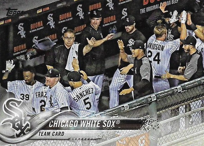
Yay! The White Sox are celebrating! Let's send the Sox logo down the waterslide!
The shiny, glowing effect around the logo and on the top part of the slide seems to indicate motion as the logo swooshes down the slide. I can't see anything else. Not even those particles breaking off to the side that looks like when Mike TeeVee got zapped into a million pieces overhead in "Charlie and the Chocolate Factory".
I'm glad to get a name out of the way quickly for this design. Because I didn't do so for last year's design.

I've knocked around a couple of ideas for the 2017 design, but I'm not enamored with any of them. This design has a TV graphics feel, but that's what I named the 2016 design. So for this design I'm going with the "steel girder set," because that's what the bottom part looks like to me, an intersection of steel girders.
I'm not committed to that name, so if anyone has a better idea, just say so in the comments.

During the last Define the Design post, I floated an idea for the 1990 Donruss set. It's a favorite of mine. I'm calling it the "ladybug set," because of the red background and the dark speckles.
Others had different interpretations of this design, although none seems to really hit the mark for me. I can see the point of those who consider it the "cursive set," because of the player name at top. But then what am I calling the 1978 Topps set? (Maybe the "script set"?). Anyway, the "cursive set" is an alternate design name because I've got to get all of that red in the name somewhere.

I remain stumped on a name for the 1986 Topps set. I've mentioned the "Ebony and Ivory set" and the "black-and-white cookie set." I remain stuck on the team name though. It's so monstrous that it seems almost impolite not to reference the team name in the design name somehow.
I tried looking up the font used for the '86 team name for inspiration.
The font name is Napoli Serial Heavy.

But calling it the "Napoli Serial Heavy" design is not very helpful. (EDIT: I could call it the "(Mike) Napoli design").
I'll keep looking.
Some collectors have said that the '86 design is a homage to the 1964 Topps set.

I don't think there's much of a connection. However, both sets do share a gigantic team name at the top of the card.
And this is where I'm going with a define-the-design name for the 1964 set.
If you look at the history of team names on Topps cards prior to the 1964 set, you will realize what a major change it was to showcase the team name in such a way.
A look at previous team name listings for Topps from 1953 to 1963:


All of those listings are very small, tucked away in the bottom right corner, or top left corner, and never the focal point of the design.
Those 1964 team names must have knocked kids over when they opened packs for the first time that year. They're HUGE!
So, I'm calling the 1964 set the LARGE TEAM NAME SET.
We've become immune to large team names thanks to the sets that followed, 1971, 1975, 1977, 1984, 1985, 1986, etc. But it all began with 1964.
So, I think I'll stop there. I named three or four card sets, so that's cool. I'll update the Define the Design tab in the next day or so.
Next time I'd like to see if I can nail something down for the 1986 Topps set, and maybe get more into some sets from Score or Pacific, which I've barely addressed.
Comments
2017 for me is the Perspective Logo set since their weird transformation on all the logos to make them fi the vanishing points in the TV graphic just don't sit right for me.
I always thought of abstract art like Jackson Pollack for the 90 Donruss set. “Red Pollack” maybe? And I like the two names you had for ‘86.
I call this year the Rolling Stones set
"Ebony and Ivory" just makes one humm along with that pleasant Stevie Wonder & Paul McCartney single and forget all about baseball. "Piano Keys" gets that done a bit better for 86.
1982 was the hockey stick set. Already been done.
86 - Black Team Banner set. 64 - Big Team Banner set. 90D - Red speckled cursive writing set. (Reminds me of cursive writing exercises in grade school with the three lined paper etc.)