Major League Baseball has designated pink as the color for Mother's Day at its ballparks for the past dozen years or so.
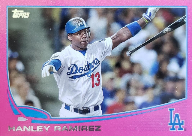
Topps has followed suit with pink parallels that are not called "pink parallels" but "Mother's Day parallels."
This is the first one of those type of parallels that I landed. But I haven't bothered to find that many more. They're not cheap and because Topps has numbered them so low, usually just 50 available, they're tough to find.
I find it odd that Topps has made pink such an exclusive color.
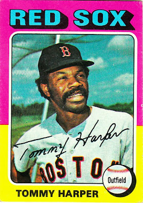
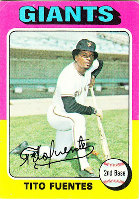
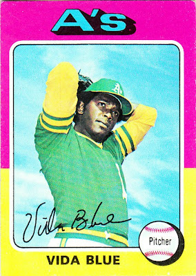
In the world that I grew up in, pink was not exclusive on cards. It was everywhere on cards. All I have to do is show you one card from the 1975 Topps set, the first set I collected.
This was life in the '70s. Colors weren't exclusive. They weren't featured only on "sometimes cards," if you could afford them or get lucky. They were in just about every damn pack.
I've always been a fan of the pink-yellow cards in '75 Topps. While collecting it that year, they were among my favorite cards, probably ranking only behind the yellow-red all-star cards (and the regular yellow-red cards with the black player names) and just ahead of the red-blue cards.
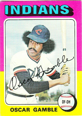
It probably helped that two of the most iconic cards from that set feature the pink-yellow design:
One I pulled in '75 (Gamble) and one I lusted after for years (Blue).
Thanks to these two cards, those who didn't grow up collecting the set maybe think this is the most representative color combo of the '75 set and that most of the card feature this color.
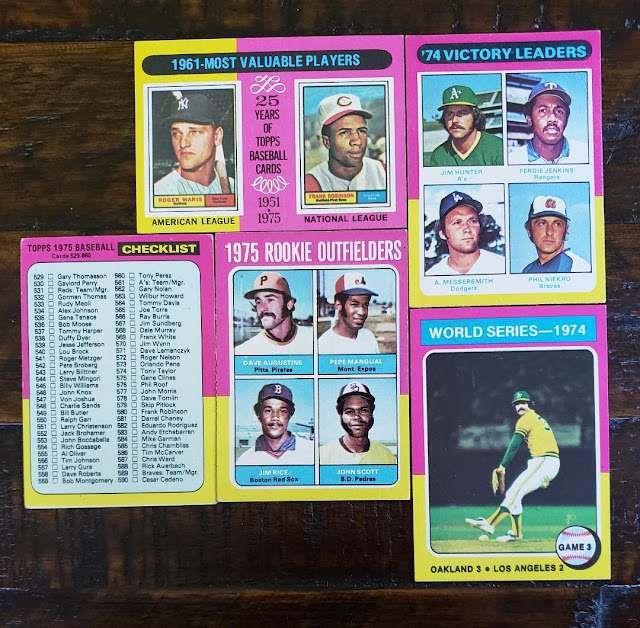
It's true, the pink-yellow combo is featured among the most times in the '75 set, along with yellow-red, green-purple, orange-brown, green-light green and another pink combo, purple-pink. But the pink-yellow combo is shown on relatively few player cards. If you filter out all the pink-yellow combos that show up on subsets, that whittles it down quite a bit.
The pink-yellow combo shows up on all but one of the subsets in '75, showing up on multiple cards for league leaders, MVPs, the postseason, rookie prospects and checklists. It's only absent from the set-opening highlights cards, which use orange-brown exclusively.
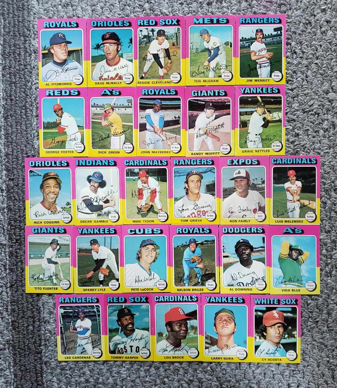
So that most versatile pink-yellow combo leaves relatively few opportunities for individual player cards. There are 27 player cards in the set with pink-yellow borders.
There are still a few '75 color combos with fewer than 27 player cards represented. Some of them have just 22 (red-blue, blue-orange and yellow-green, for example).
So the somewhat limited number does make the pink-yellow cards feel a little bit special, but it's not like you practically have to buy a whole case to find a pink card like you do now.
I've nicknamed these particular '75 cards the "marshmallow peep" design. But they could easily be "Mother's Day" cards from that time, too.
These cards basically scream spring to me and I'm sure that's why I like them so much.
Happy Mother's Day. Fortunately you get to wear pink as often as you want. It's not like clothes are numbered to 50.

Comments
It would be fun to again get a really colorful border in a flagship set, but with the need to make the parallels stand out I suppose it's not going to happen.
B. The orchids I bought for my mother had pink, but the funny thing is I don't think I ever heard my her say she liked that color ever. Yet I still associate this holiday with the color.