
OK, I'm finally posting the third installment of this "Best On-Card Element" series. I seem to have trouble focusing on this topic. I guess that doesn't bode well for anything past the '80s, if I'm struggling with decades with relatively few sets.
But that's why I love the '70s. Only a few major sets during the decade, which allows you to remember them fondly, instead of confusing '92 and '93 Ultra or '96 and '97 Fleer or what insert goes in 2002 and what goes in 2003.
For the '70s, I could add sets like Hostess and Kellogg's, even though they're not considered "major releases," but I decided not to, because it's easier ... um, I mean, because how do I pick out a best element on something like '79 Hostess? (But I'll say right now, '76 Hostess and '76 Kellogg's best on-card element is their ability to get in the spirit of the bicentennial).
So, this is a decade of Topps and just Topps. Sorry, we'll get more interesting in the 1980s, which will mean a lot of time in front of the computer for me.
To recap, I am focusing on the best element on the card, front or back. This has to do with the look of the card, not the checklist.
Here we go:
1970

1970 Topps
Best on-card element: The gray borders. This is where "best" isn't exactly the right word, but "Most Notable On-Card Element" is awkward for a blog title. This is the first time that Topps used a solid border color in its flagship design that wasn't white. The other non-white borders were in '62 and '68, but neither of those were solid colors as both wood and burlap feature shades of different colors.
Runner-up best element: I love the blue-and-yellow backs and the extremely easy-to-read card numbers.
1971

1971 Topps
Best on-card element: The black borders are the most obvious "best" element since the pennants in 1965 Topps. This was the first set to use black borders and even though there have been a number of black-bordered sets since then, particularly in the last 20 years, this one still stands alone as iconic for its bold border decision.
Best on-card element runner-up: The first use of action photographs on individual players' cards. This came into play with '56 Topps, too, but the action pix weren't necessarily the focus and more than a few of them were painted.
Best on-card element runner-up, runner-up: A picture on the back with the player's head shot. Two photos on one card, mind-blowing at the time.
1972

1972 Topps
Best on-card element: It's the marquee design for the team names. It's quite striking and very appropriate for the time, if a bit behind the '60s Peter Max Era. It's always reminded me of the Electric Company kids TV show graphic -- something I watched a lot as a kid -- even though it's not the same thing at all. What is the same is '72 Topps, that TV show, heck all the early '70s, was colorful as heck.
1973
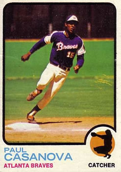
1973 Topps
Best on-card element: Tough one, because this could be several things according to each individual collector. For me, it is the wide variety of action shots that had never appeared on baseball cards before.
Best on-card element runner-up: The position guy. Not the first time it appeared, but it's probably the most prominent of the baseball card position drawings.
Best on-card element runner-up, runner-up: The cartoons on the back. The most interesting of the entire decade. Those cartoons give you better insight into the player than anything else on the card.
Best on-card element runner-up, runner-up, runner-up: The rookie cup debuts. Man, this was quite a ground-breaking set!
1974

1974 Topps
Best on-card element: Another case where the pennant flags are the best. But I'll extend it a bit further. The fact that many of the pennant flags feature a team's colors (not all of them) presents the first real opportunity for Topps to match the design with the uniform the player is wearing. The best example of this are the Oakland A's cards. But there are so many other examples.
Best on-card element runner-up: The cartoons on the back are the second-best ones of the decade.
1975

1975 Topps
Best on-card element: It's extremely difficult to be objective with the cards that I pulled out of packs for the first time. I'm going with that this is the most colorful set Topps ever created for its flagship set. You could argue that this was 1972, but I think the variety of two-tone borders that aren't connected to the team at all gives the perception that it's more wildly colorful.
Best on-card element runner-up: The first time in a Topps set that a baseball illustration is used for the position. Topps would do this again in 1978.
Best on-card element runner-up, runner-up: That position baseball turns into a star for the All-Star starters' cards. The first time Topps used a star to note all-star status on an individual player card.
1976

1976 Topps
Best on-card element: Clearing room for the photo. This isn't a unique aspect as there were other Topps sets that arguably did it better, like '57 and '66 and '67, but '76 is a striking departure in comparison to the sets that came immediately before it, in which design was the main element.
Best on-card element runner-up: Many would say it's the position guy, even if it showed up only three years prior.
1977

1977 Topps
Best on-card element: Not a lot to choose from here, but I'm a big fan of banner team names and that is something '77 Topps has.
Best on-card runner-up: position flags!
1978

1978 Topps
Best on-card element: Script names in color. Topps had done this before, most significantly in 1970, but they really stand out in '78. And it's been perplexing Topps to this day, so all the more reasonable it's notable.
1979

1979 Topps
Best on-card element: The first time Topps incorporated its logo into the design on the front of its cards. Again, this comes under "notable," rather than "best," unless you're some sort of corporate zealot who loves plastering the company's name all over everything.
Best on-card element runner-up: I like the straight ribbons.
Best on-card element runner-up, runner-up: The "On This Date" baseball history facts on the back.
OK, that takes us to the end of the easy portion of the exercise.
I'll definitely tackle the '80s. But I'll need a nap first.
Comments