
I don't know if you're aware of it or not, but we're in the middle of a border war. Topps doesn't think we need them anymore.
It scrapped the borders from its flagship set this year for the first time in ... well, ever. And it plans to do the same thing in 2017.
As I've said before, I don't think lack of borders is the biggest problem with 2016 flagship, I have so many other issues with it. But taking the border away from flagship is just plain wrong. I know people born after 1985 don't know what I'm talking about -- they were six at the most when Stadium Club first showed up for crying out loud -- but borders give a set character. God, I hate how many times I've said this, but, look at 2015 Topps. That set had character out the ever-living smokestack because it had fat borders in a rainbow of colors.
In 2016, we have fog and smoke and slashy TV graphics to give our sets character. Doesn't do it for me. I've got to have that border. Otherwise it's a watered-down version of Stadium Club.
So I decided to throw a border on this year's flagship, to see if it would've looked any better. Here's a Todd Frazier in a basic white model:

What I should be doing is putting a black border on these things. It is Black Friday, right? I've got to do something to occupy my time if I'm not shopping with the sheep today. Let's put a black border on these things.

I had to be selective with the card I used. Topps likes to zoom in so close on its subjects these days (another modern card technique that I wish would go away) that there were body parts touching the edges of so many cards. At least Chris Davis here has some room to breathe.

That's 2016 Chris Davis with a border. Doesn't that look better? Wipe away the smoke and that's almost a collectible card.
Here are a few more:


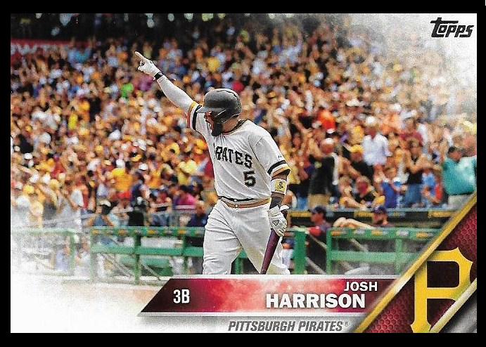

Damn, those look so much nicer.
This is kind of the quick-and-dirty opposite of what Gavin does at Baseball Card Breakdown, where he removes the borders of classic sets to see what the cards would look like full-bleed. Most of the time when I see those posts, I think "yeah, I like the border better."
But then I was 20 in 1985. And every card set had a border. And the concept of "Black Friday" as a "get-up-early-and-shop-all-day extravaganza" was only a few years old.
Some things, though, should never change. Borders on flagship being one.
Comments
Looking at these cards, I can just hear the accompanying bang of a jail-cell door that inevitably accompanies these self-important graphics on TV.
SHOW THE WHOLE LOGO, DAMMIT!
I like to see if there are some dust or dirt fying around when they slide. With that corners fog I can't see it!
Cards without borders look unfinished. Like the cutting machine had some problems and cut the cards the wrong way and something is missing.