(Greetings on "Red Planet Day," which commemorates the day when Mariner 4 was launched in 1964 to become the first spacecraft to fly past Mars. This seems like the perfect day for me to order my very first "Mars Attacks" card -- although I see they aren't cheap. My nonsports collection is quite paltry when it comes to the '60s. For more on '60s cards, read on for Cardboard Appreciation. This is the 309th in a series):
As someone who has collected for decades now, I find myself re-evaluating my opinion of specific sets.
I am a set-collector first, so the look of a set, rather than who is in the checklist, is most important to me. And because of that, I have my favorites and my non-favorites and you've seen all of my opinions on that through ranking series and all kinds of other posts. I gots my opinions, don't I?
For sets that came out during my first years of collecting and all the way through my early 20s, there is no chance I will change my opinions on those. They were formed a long time ago when such things were very important and, therefore, the '75 Topps set will always be fantastic, as will the '72 set, the '83 set, the '86 set and, heck, just about anything between 1971 and 1988.
But there are card sets that came out in other decades in which either I was too young to collect, had abandoned collecting or plain just didn't exist yet. I have opinions on those, but since I wasn't pulling those cards out of packs, evaluating each as it was extracted, they aren't based on a lot. So sometimes my opinions change.
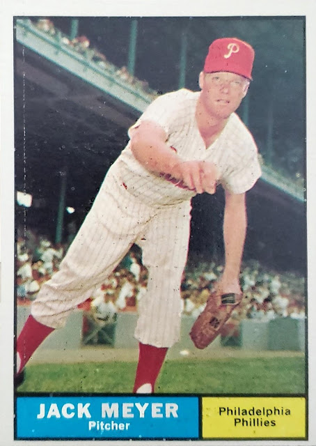
The 1961 Topps set and Jack Meyer here is a good example. Look at all that space for the photo, the better to see Meyer fake-tossing in front of a decent crowd in what I believe is Shibe Park. That's a nice window into the early 1960s there.
Yet, back when I did a countdown of all of Topps' sets between 1952-2015, I ranked the '61 set 50th out of 64 total sets. I said, "this set might put me to sleep quicker than any other."
Harsh.
I said that mostly because I was dismissing the minimalist design (the two rectangles at the bottom) and the sheer number of head shots, many of them without hats, featured in those 587 cards.
But, now that I am reconsidering those sets of the '60s, I think there's enough in '61 to love and if I ever had the fortitude to collect two 1960s sets at once, I might put some effort into it. But for now, a simple re-evaluation will have to do.
What other set from the '60s have I re-evaluated?

1964 is up there.
I will never consider it my favorite of the '60s, but it definitely has its charm. I love the large team names at the top. And the 3-D effect that is achieved by players breaking through the top part of the frame is an overlooked delight. One of the first times Topps did this, I believe.
So, of all the major sets from the 1960s, here's where I stand:
STILL GREAT
1965 and 1967 Topps, 1963 Fleer
STILL LIKE MORE THAN MOST
1960 Topps, 1960 Leaf
STILL LIKE LESS THAN MOST
1962 Topps, 1963 Topps
BETTER THAN I THOUGHT
1961 Topps, 1964 Topps
GOOD FOR WHAT THEY ARE
1960 and 1961 Fleer, 1969 Topps
STILL JUST DON'T GET IT
1966 Topps, 1968 Topps
I do the same re-evaluation for a lot of sets from the 1990s and even stuff from the last 10 or 15 years in which there was so much to collect that I may have dismissed it the first time, just out of trying to preserve my sanity.
All of this re-evaluating reminds me that I'm overdue for another Best On-Card Element post. I'll have something for the 1970s coming up this week.
It's good to re-evaluate and reassess. Even if it's only about cards.
Comments
'64 is a set I started to appreciate more when I had a bunch in hand. Flipping through the cards with the different brightly-colored team names is enjoyable.
Card design aside, I'm a bit surprised the cards commemorating the 1963 World Series didn't influence your feelings.