
This is the wallpaper for our desktop computer at home.
I still use this computer a lot for blogging, even though it's ancient and could die any day. But my wife chooses the wallpaper. It's usually a holiday theme that goes with the decor in the room where the computer resides. But ever since the Bills' season, it's been the Bills logo superimposed on Bills Stadium with a red filter.
My computer at work also features sports wallpaper. It's an overhead shot of Mookie Betts connecting on a pitch during the Dodgers' wild card series with the Brewers last fall.
My laptop doesn't feature a sports backdrop. Instead, the wallpaper is of sweat-soaked Swedish singer Maria Andersson during an Australian concert by the late pop-punk band Sahara Hotnights, circa 2003.
My phone displays music wallpaper as well. Right now it's the cover for the Queensryche album "Empire," which just celebrated its 30th anniversary.
Now, while all of the above is appropriate -- music and sports are my primary interests -- there are no family photos as wallpaper, which makes me feel a tad guilty, I admit. And even more strange, there is no baseball card wallpaper on any of my devices.
I really began to question my wallpaper decisions when I saw a display on Twitter the other day. It was a bunch of 1975 Topps cards flipped over.

It was something like that (although not quite as blurry). I actually stopped what I was doing and stared at it for a minute or two.
It was the most calming picture that I had seen in who knows when. Every worry and concern disappeared as I absorbed those familiar card backs from my childhood.
I immediately wondered why it had taken me so long to fill the backdrops of all my devices with baseball card backs.
So I took a few pictures.

There is a beautiful blue backdrop from 1980 Topps, one of my favorite card backs from that period. This would definitely drive away every care.

Going old-school with 1967 Topps. You can see the contrasting shades of green and lots of stats to keep you busy before checking your stupid email.

Not a lot of color with this one as it's the backs of the 1982 Topps sticker set. Backs don't matter much with stickers because they get thrown away after the fronts are stuck.
Maybe viewing this isn't as calming as sticking stickers in a sticker book though.

If you want a bright background, 1992 Topps will work quite well. Nice-and-clean. Although if you consider Topps' move away from gray cardboard this year as a travesty then maybe that will nullify the calming effect.
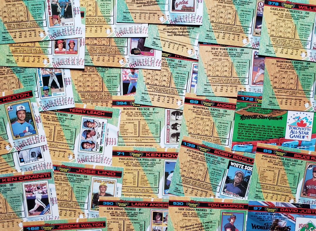
Perhaps you want to recognize one of the milestone sets in history with your wallpaper. The 1991 Stadium Club set will work with that. Plus you get a nice view of every player's rookie card front ... on the back!

This might impress someone as it's wallpaper of cards from the elusive 2011 Topps Update set. Although I made sure not to include the Trout rookie -- or any of the other notable rookies in the set. I don't find "what's it worth" topics calming.

This is one of the most colorful card back collections that you could choose for a wallpaper image. I've actually used the backs of the 2017 Topps set for wallpaper on my laptop, back when 2017 came out. They're much more interesting to look at than the fronts from this year.

But if you want your wallpaper to fill you with pride, maybe do something like this as I am able to stuff my backdrop with the biggest names in the 1956 Topps set like a big shot.
I'm pretty certain this will appear on one of my devices very soon.
And the cards from the set will appear on this blog again very soon.
Comments
If the USPS does it's thing, it is imminent.
I have my kids on the family laptop, Fenway Park at sunset on my phone, and my work computer rotates a bunch of free artwork from dititalblasphemy.com
1992 Topps backs make me sad because they're so great. Bright and readable, but still matte so they feel like a real baseball card. Wish they would have done that more years, instead of going with glossy backs starting the following year.