
Topps Heritage is scheduled for release on St. Patrick's Day. Although I enjoy the 1972 design a lot -- have I mentioned I've completed that set? -- I won't be buying much of this year's Heritage, probably no more than a sampling.
I'm still too involved with 2020 Heritage, because that's how long it takes for a rational collector to complete a Heritage set. Actually it takes longer than that: I'm still trying to finish 2008 Heritage.
But I've gotten a lot farther on 2020 Heritage than I ever imaged at this time last year. Recently I received six needed cards from the set from reader Ben. He sent a very nice "thanks for blogging" package and you'll see the rest of the goodies another day.

This card put me four cards away from completing the non-short-printed portion of the set. That's pretty damn good for someone who hasn't seen much of this set for sale since a year ago at this time.

The rest of the Heritage cards in the package were all short-prints. And you all know how pesky these things can be.
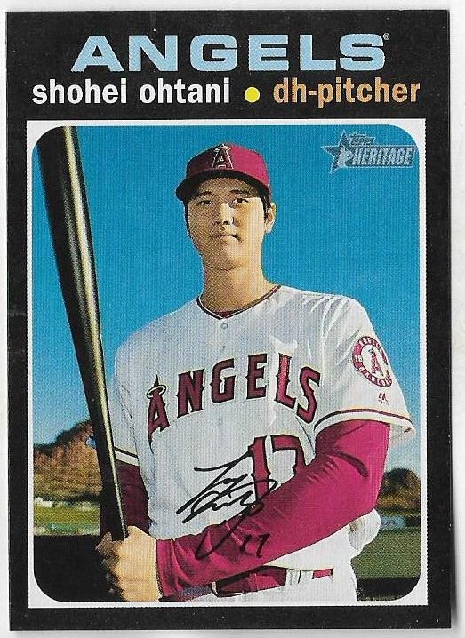
That's the other short-print I received. Per usual, Topps stocks the Heritage short-prints with all of the most notable players. Among the few SPs I've accumulated from this set are Ohtani, Tatis Jr., Lindor and Trout. Out of all the things that the Topps Heritage brand has done to stray away from its original intent to replicate the original set, this is the most annoying.
I still need 74 -- 74!!! -- of the short-prints. And unless I get all of them in trades/gifts, that will cost me probably around 5 bucks a card. That's $370 for 74 cards. So I see this set stagnating incomplete in a binder much like my 2008 set.
But enough crabbing. I need to get to the beautiful part.
The 2020 Heritage set pays tribute to the 1971 Topps set, of course, and it's the reason why I was drawn to it. It's one of my favorite sets of all-time and I devoted an entire blog to it.
I consider it the coolest set ever made and it's because the borders are black. Those cards are amazing to view. I've believed this since I first saw them as a youngster, probably no more than 12 years old. What are these? I believe that was my first reaction.

The 1971 set is 50 years old this year. It is the king of the black-bordered sets. There is a "Fab Five" of black-bordered sets with '71 Topps by far the best.

My attraction to this set came from the combination of the black borders and the multi-color type that seemed all the brighter against the dark background.

Another black-border set that is also celebrating an anniversary is the 1986 Topps set, which is 35 years old this year.
These days, the '86 set is often considered a riff on the '71 set or a combination of '71 and '64. Folks point out the grainy pictures and other photo weirdness. I even read another blogger today saying he didn't care for the '86 design much.
And to all of this I say, the only thing I thought when I opened a pack of these cards -- and I wasn't even collecting at the time -- is that they were SO. DAMN. COOL. They seemed cutting edge at the time, unlike anything else released at that time and for years before.
I still look at them that way. I love the giant team names, they're extremely colorful, as a baseball card should be.

At the same time, I don't feel as if the teams that were shut out of colorful displays -- the Yankees and White Sox -- got snubbed. I quite like the look of these, too.

The third member of the fab five black-is-beautiful club is 1985 Donruss, which obviously was issued a year before the 1986 Topps set.
Again, this set was striking when it first hit packs. To this day, I don't see it around much and I'm going to credit those black borders for that. Those borders are rather thin -- they don't allow for color type to appear on top of the black. For that reason, I don't like it as much as the first two sets.
But I do like it quite a bit for a Donruss set. It's one of my all-time favorite Donruss sets.

I like it better than this black-bordered '80s Donruss set. 1987 Donruss is OK. But that's all I'm willing to give it.
The floating baseballs and yellow strips that break up the black ruin the appeal of a continuous black frame for me. But it's still good enough to fit into the top 5.

The final black beauty is the much-maligned 2007 Topps set.
I like this one more than most and as the years pass and the memories of all the gimmicks that plagued this set fade into the background, I enjoy it more and more.
It's a victim of the foil era, not nearly as bright and beautiful as earlier black-border sets. But the blackness is so apparent and almost oppressive, that I think the photo stands out against it.
You'll notice the chipping that collectors complain about with black-bordered set. I'm not that particular. I do like the sleekness of black-bordered sets and seek out versions with as little chipping as possible. But as someone who collected '71 Topps, you have to make sacrifices with some of the cards and, for me, black-bordered sets are worth making that sacrifice.
Notice none of the black-bordered Bowman sets made this select group. That's because they're Bowman sets. Unless Bowman is going to go back to the days when their design was an old wood-paneled TV, then I can't take their designs seriously.

I suppose it's natural that I gravitate to sets like this. I'm a night owl. I have an entire binder dedicated to night cards. My blog background is even dark.
One of the best set parallels ever was the black-bordered 2009 OPC cards. (I've given up on that completion quest though, just too many cards and too many other interests).

Giving your set black borders is an easy way to get me to collect your cards. The 2021 Topps set has 1986-themed inserts this year and, naturally, I'm more interested in them than some of the other retro parallels of recent years that replicated '80s cards.
I just picked up this Clayton Kershaw silver-pack insert card online, and I know if he wasn't on the '86 design I wouldn't have bothered going after it so quickly (I waited a long time to get all of those '87 design Dodger inserts).
Black is beautiful, I wish card companies would consider that more often.
Comments
As for this year's Heritage, I'll be back to the Tigers cards, especially the Matt Boyd cards.
Good Job.
'85 Donruss would be my Number 2. That, along with the '07 Topps base set are two of the most underrated designs of the modern card era. Props to '85 Topps football for taking black borders to a new level. '87 Donruss borders look better in the other colours that the other sets used, especially the maroon Opening Day set.
Still not sold on 2007 Topps, though - didn't like it much at the time and it hasn't grown on me since. I do give it points for at least trying black borders, which as you said, I wish sets would experiment with more these days.
I don't like black quite as much on baseball cards, but it still makes for a really nice baseball card.
As for 2021 Heritage... I probably won't open any packs or boxes... but I'd love to buy a complete set at some point to go along with my 1972 Topps set.