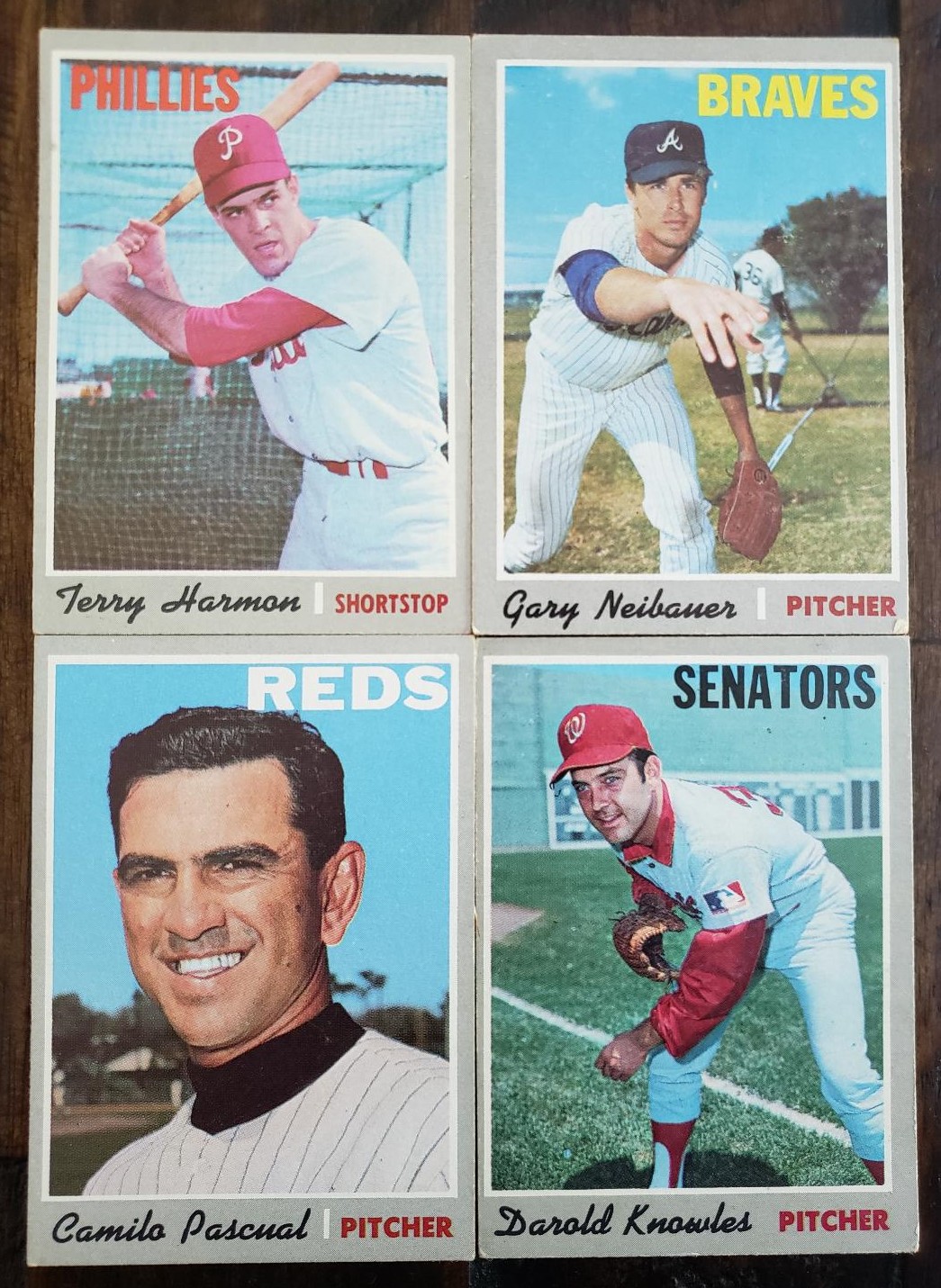
Whenever I finish a vintage set that arrived before I started collecting, I let some time pass for admiration purposes and then I go through and pick it apart.
By that, I mean pinpoint the cards that could be upgraded some day. While I'm completing a set that old, I usually ease my condition standards a little because collecting an old set is difficult enough. After some time has passed, I can see that maybe I should have held out for a card in better shape.
Whether I ever do upgrade those is another matter.
I recently finished the 1970 Topps set and I just went through it and, weirdly, the upgrade candidates are in the low numbers. I guess that will help with cost!
While making a list of potentials, I decided to chart a 1970 element that has always interested me and I'm sure it's been mentioned by collectors before.
Why are there just four cards in the entire set that use blue for the team names?
The first series lulls you into complacency with Grant Jackson at card #5 and then Renko at #87 and Johnson at #125. It's possible if you were buying first-series packs you pulled some of those blue names and thought they were as common as the red or yellow names. How wrong you were.
Meanwhile, Ken Tatum's team name doesn't show up until the final series at card #658!
They all show up in the second series at cards 182, 247 and 249.
To get an idea of how rare the blue and green team names in the set are, let's look at the four "main" colors for the team names in 1970 Topps.
Those are red, yellow, white and black. These colors are very common in the set, especially the first three.
Yes, that means I counted them.
This doesn't include the prospect cards or anything else other than individual player cards.
RED: 259 cards
YELLOW: 150 cards
WHITE: 123 cards
BLACK: 62 cards
That's about all the information I have about that. Anything more would have to come from a printing expert or someone who has researched this set a little more.
But once again, some of my color curiosity has been satisfied.


Comments